Figma Variant Card System
JOURNEY NATIVE MOBILE APP NOTIFICATIONS
Although it’s not filled with beautiful imagery or breathtaking layouts, an important part of designing the notifications screen for the Journey social media app was setting up card component variants to add to Journey’s overall design system.
This is the process I worked through, creating 3 tiers of variants derived from a base notification system, as well as deliverables for the development team.
UX & UI
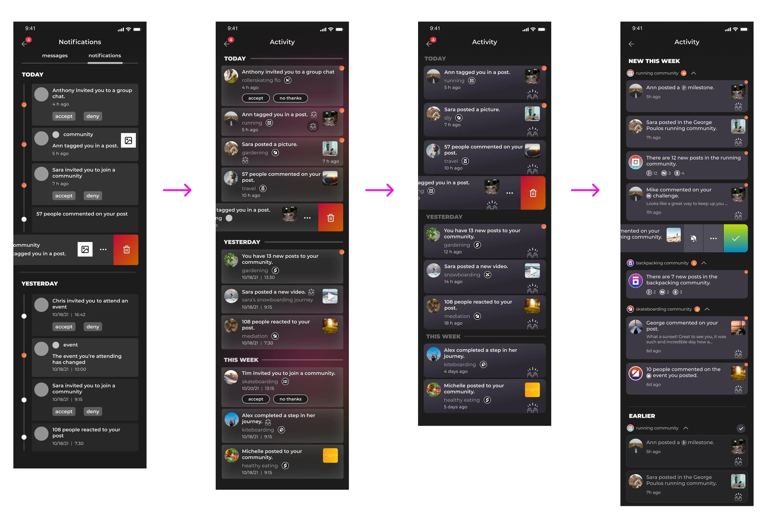
Before digging into variants, UX and UI needed to be iterated on again and again. Here are some things we jammed on as a design team.
UX
•Best way to categorize notifications
•Collapsable categories
•Tab Notifications with Direct Messages
•Date and time stamp - how granular
•Swipe left, swipe right
UI
•Card backgrounds, rules, spacing
•Color and opacity: background, card, text
•Graphic elements
•Unread indicators: location and design
•Buttons
•Date and time stamp look and location
•Community icon size and location
•Reaction icons
After multiple rounds of reviews and reiterating, I finally landed on the perfect UX and UI. From there I began the undertaking of creating a variant card system.
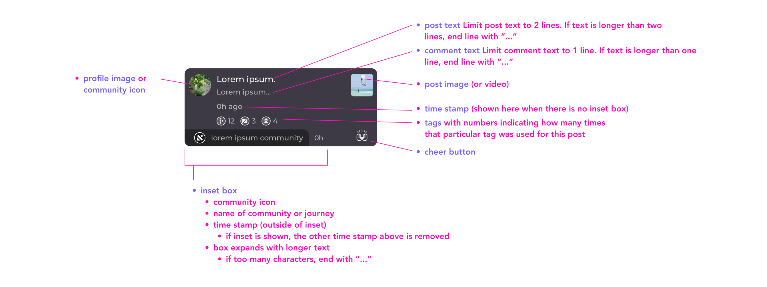
CARD COMPONENT DETAILS
I began by outlining all possible and necessary elements within a notifications card. I labeled each element with a short description so reference would be clear and concise.
BASE VARIANTS FOR NOTIFICATIONS CARDS
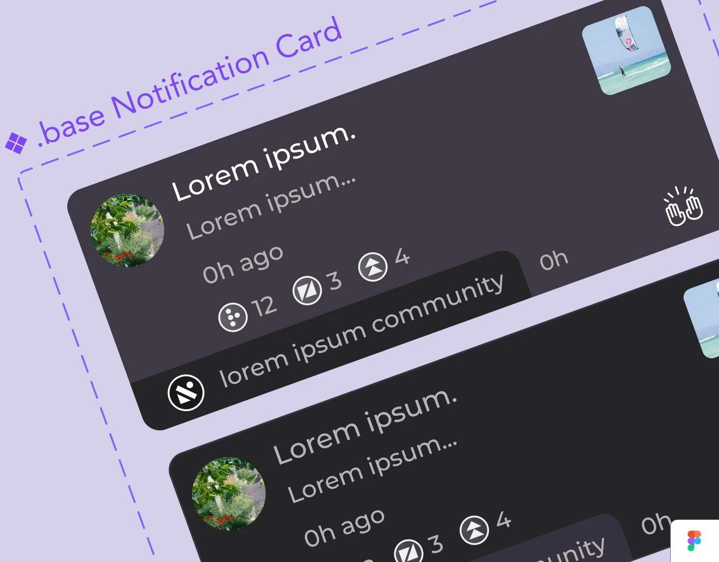
Next, I created base level notifications, made up of 2 variants (“new this week” and “earlier”). Each included every and all possible notification card elements. I utilized auto-layout for every element of the card, providing a quick and easy way to create each different card while maintaining all spacing and layout specifications.
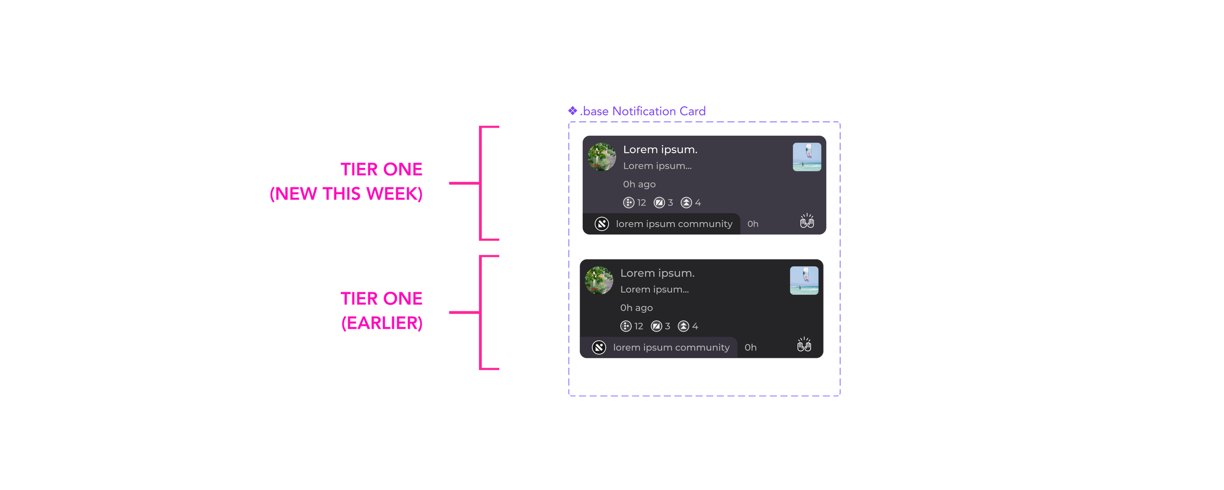
VARIANT BREAKDOWN
From there I created the 2nd and 3rd tier variants. Tier 2 included a separate variant for every type of card we would need based off of a provided spreadsheet. These were basic components with dummy text. Tier 3 was created using actual content examples from the spreadsheet. I created a system to identify each card. Tier 2 (letter), and tier 3 (letter and number).
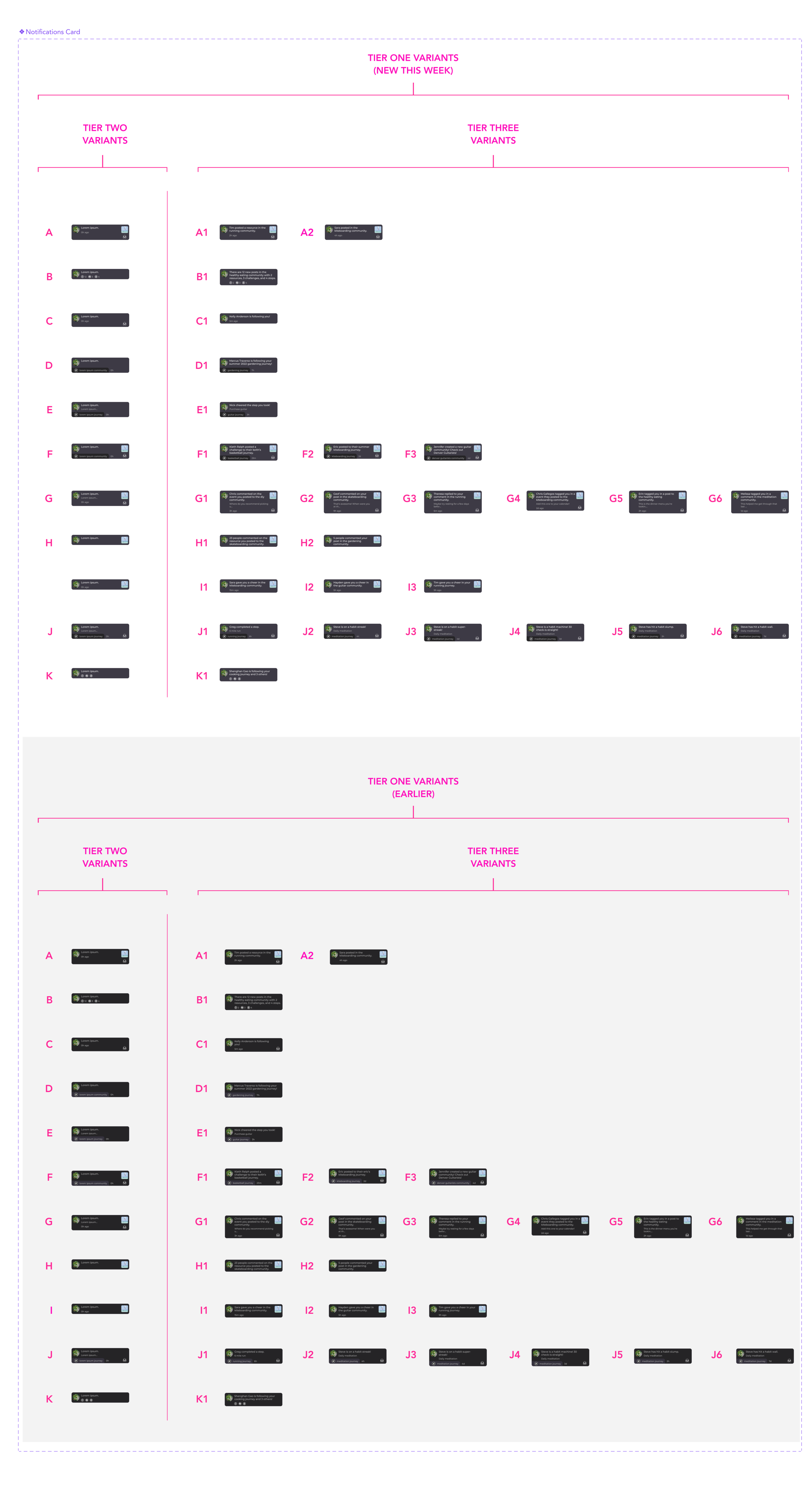
VARIANT I.D. SYSTEM
Each card was labeled with it’s code in the variants panel in Figma. I also added a column in the spreadsheet containing the letter code that corresponded to that card.
I entered a link in variant properties, connecting the specific card to it’s corresponding cell on the spreadsheet to make access and reference back to the exact location in the spreadsheet quick and easy.
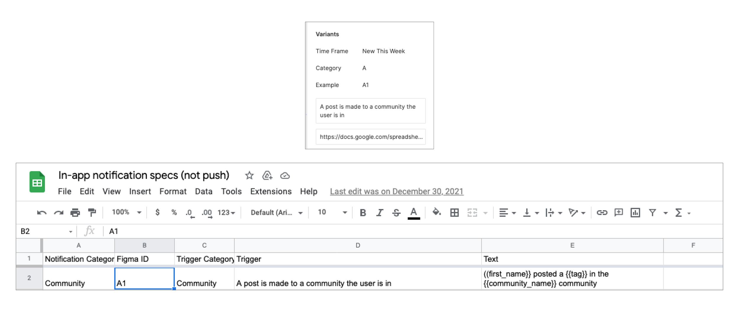
EXAMPLE SCREEN & DELIVERABLES NOTES
After the variant system was complete, I created an example screen for dev utilizing at least one tier 3 example from each tier 2 category, adding notes for relevant cards. I set up auto-layout for the screen allowing cards and components to be added and removed without upsetting spacing or layout specifications.
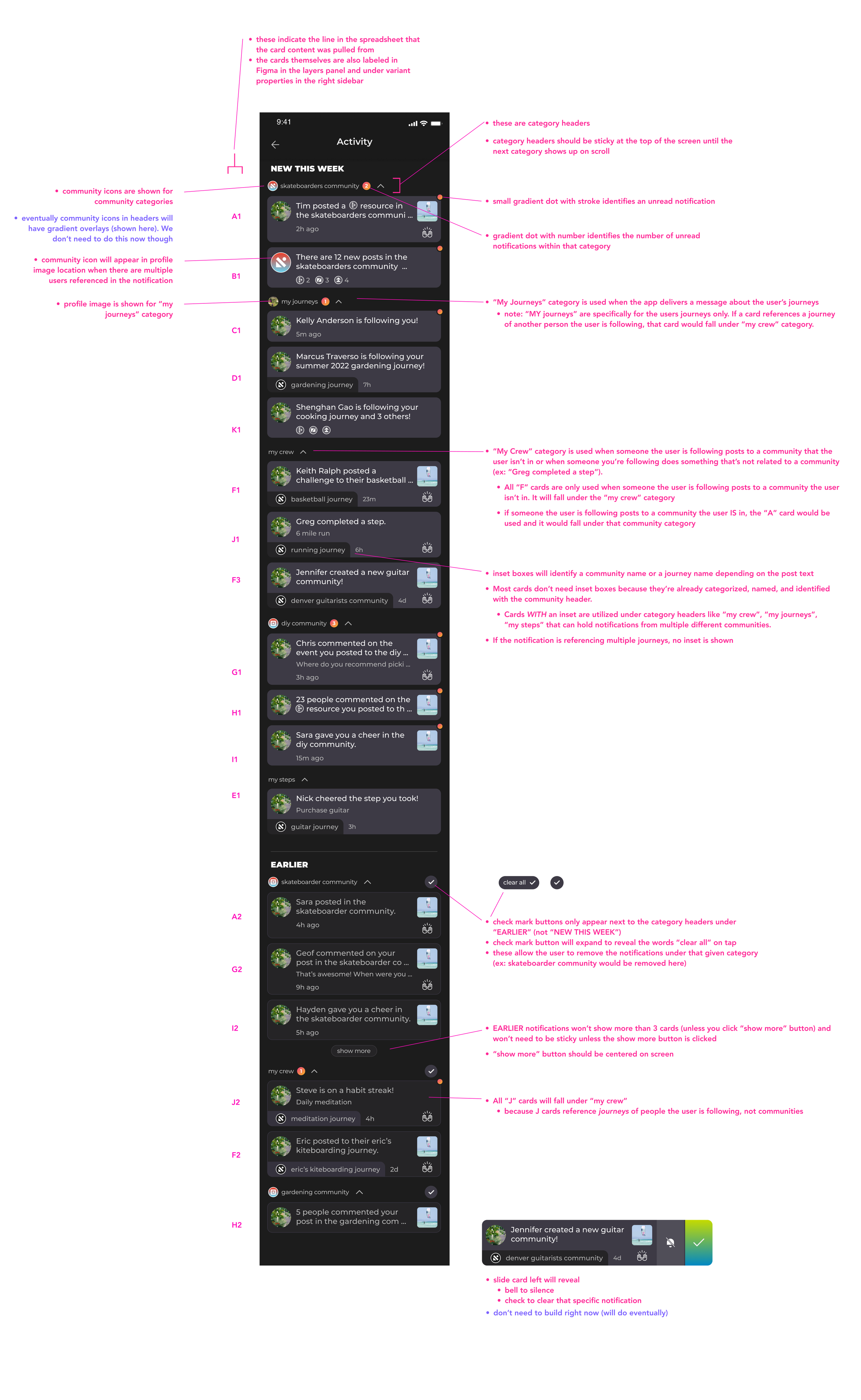
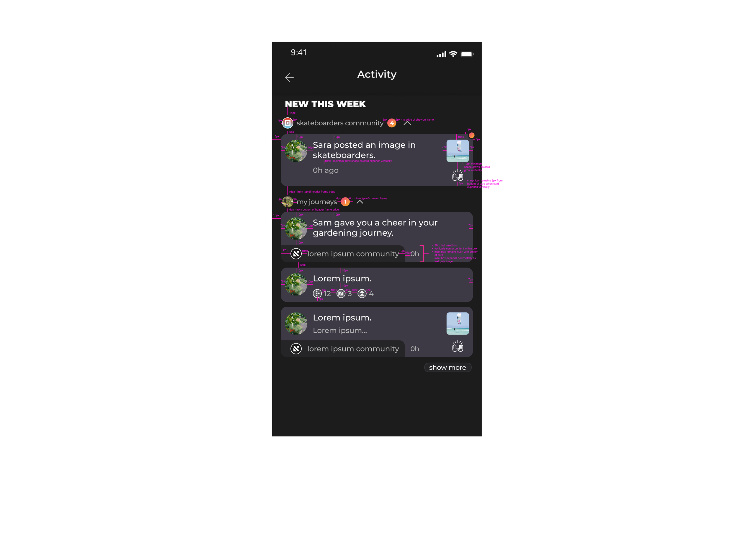
EXAMPLE SCREEN & MEASUREMENT SPECS
Finally, I created a second screen outlining spacing and measurements, and provided a Berrycast video walking through each detail of deliverables.
