Avalon Waterways Print
This project for Avalon Waterways consisted of 4 different die-cut and folded print pieces. Each piece was to be delivered to our B2B partners and passengers traveling aboard a new Avalon ship, for a week cruising down the Rhine River in Amsterdam.
I was responsible for creative concepting, typography, layout, color correcting, and photo editing. Each piece was printed on pearl metallic white, high-quality paper and card stock. I worked cross-functionally with the marketing, copy, and management teams.
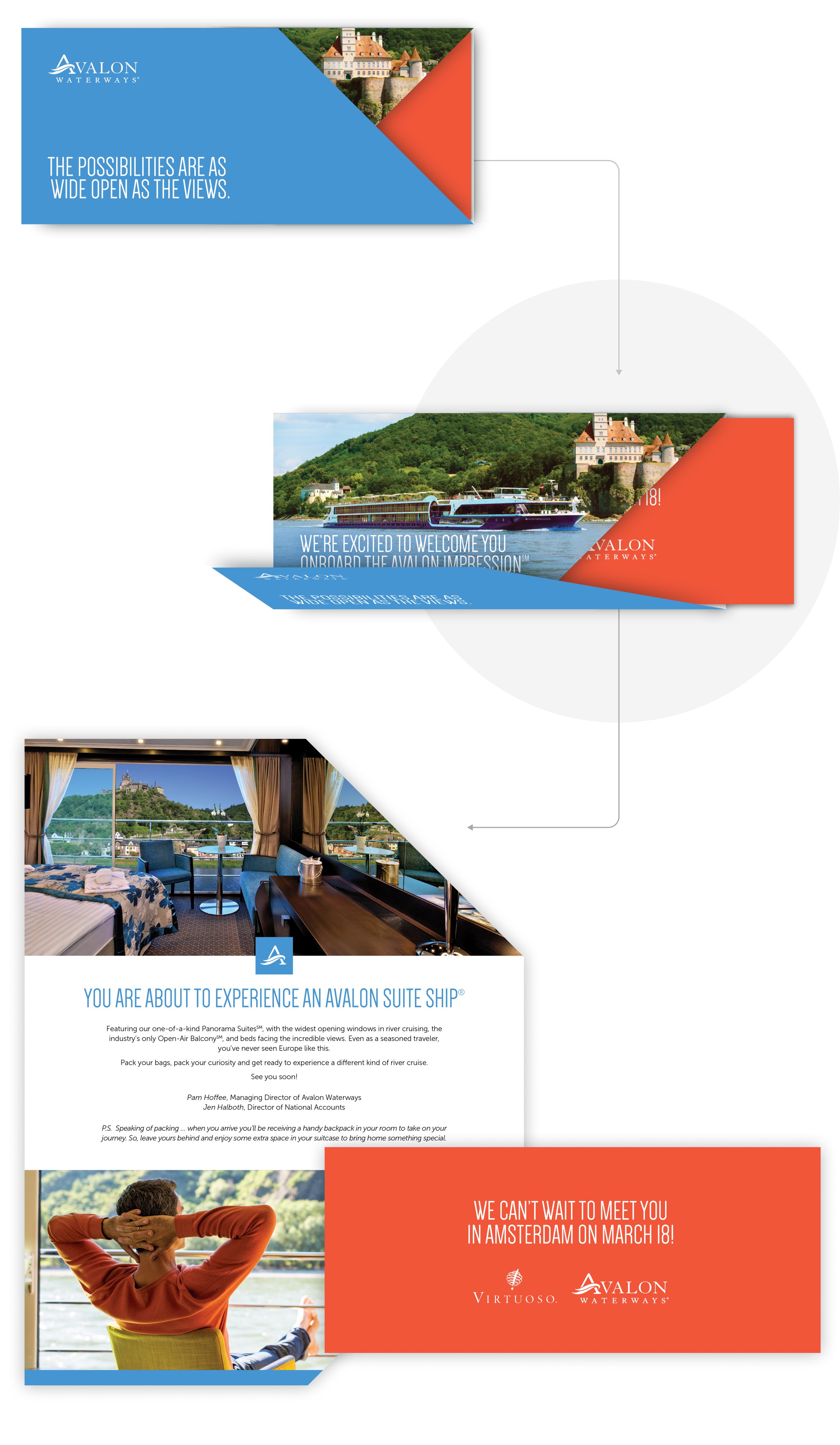
GET READY
This tri-fold piece with insert was delivered to each passenger before departure to create excitement and prepare them for their trip. The die-cut was created to mirror the look and feel of an airline ticket and envelope.
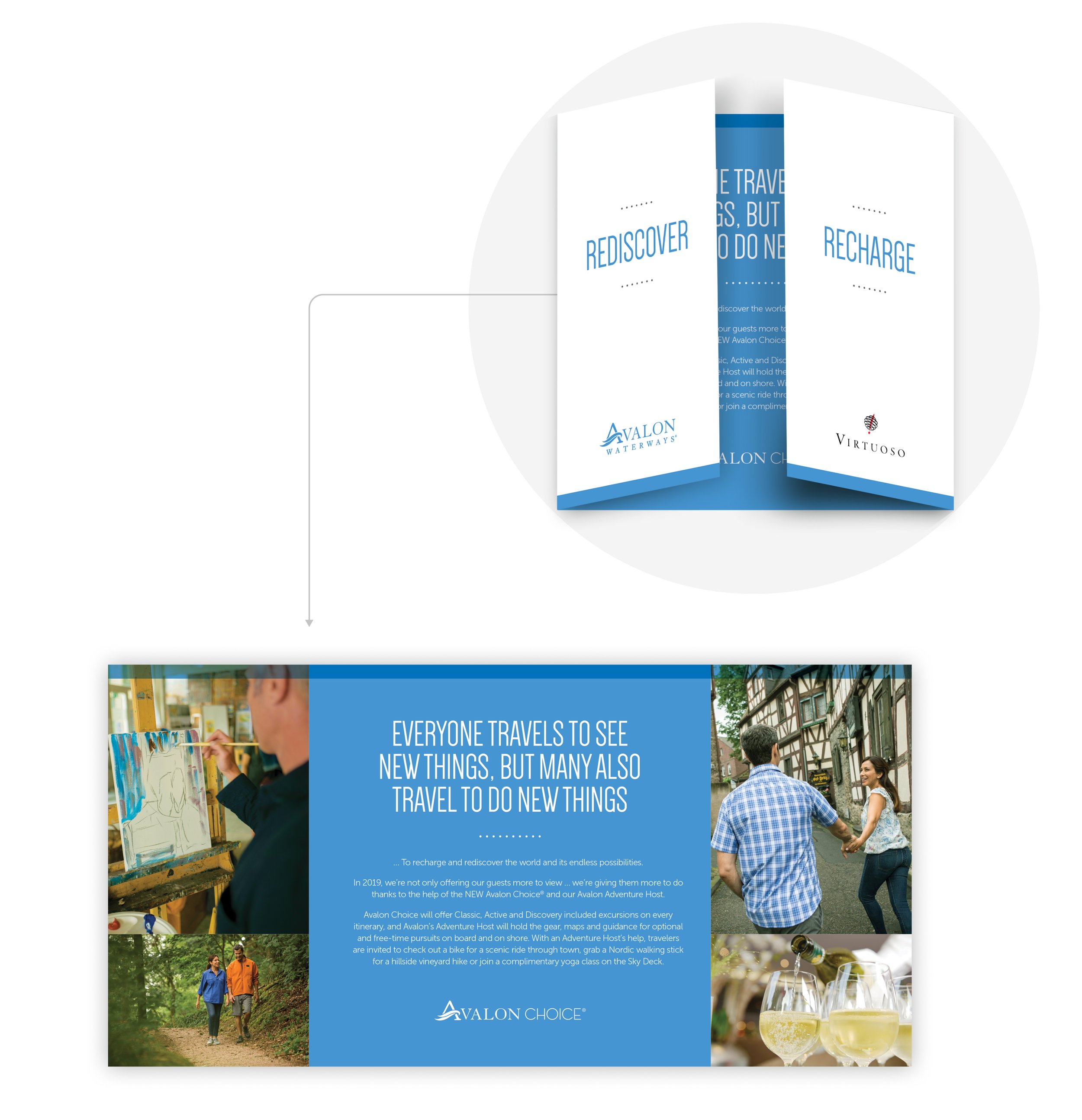
ADVENTURE
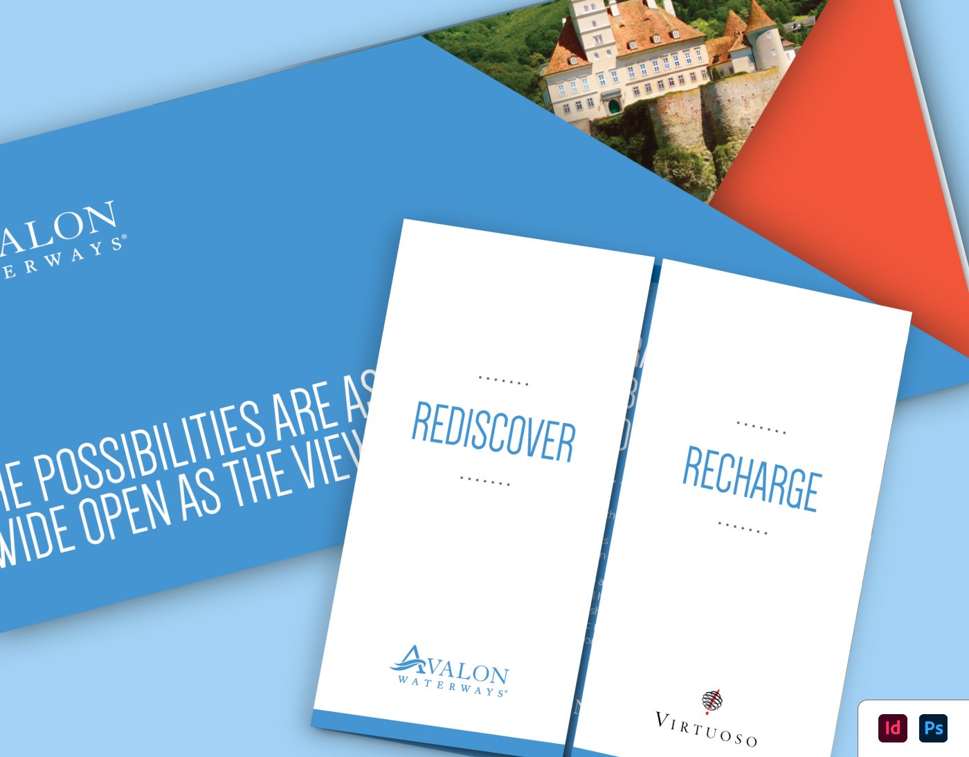
This tri-fold card was left in each passenger’s room, providing information about Avalon’s different excursions and itineraries. The tri-fold opened from the center, suggesting the idea that the passenger was opening doors to a new adventure. I selected photography that reflected the types of experiences available on the tour.
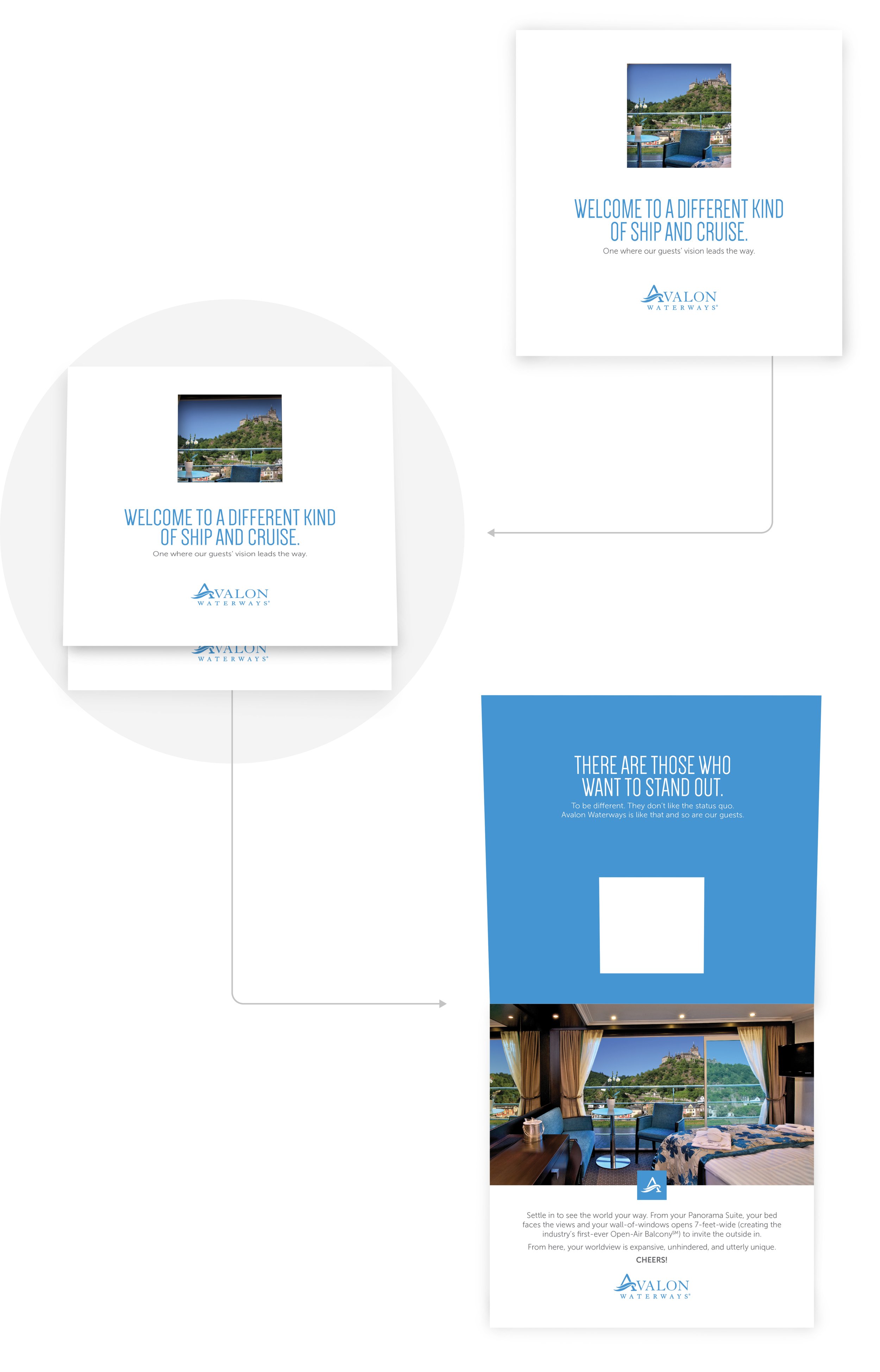
A ROOM WITH A VIEW
This bi-fold card delivered a message about an important differentiator for Avalon, a suite with a bed facing a 7-foot wall of windows with a sliding glass door. To reflect upon this differentiator, I created the card to include a die cut “window”, providing a peek at the image of the suite with a view.
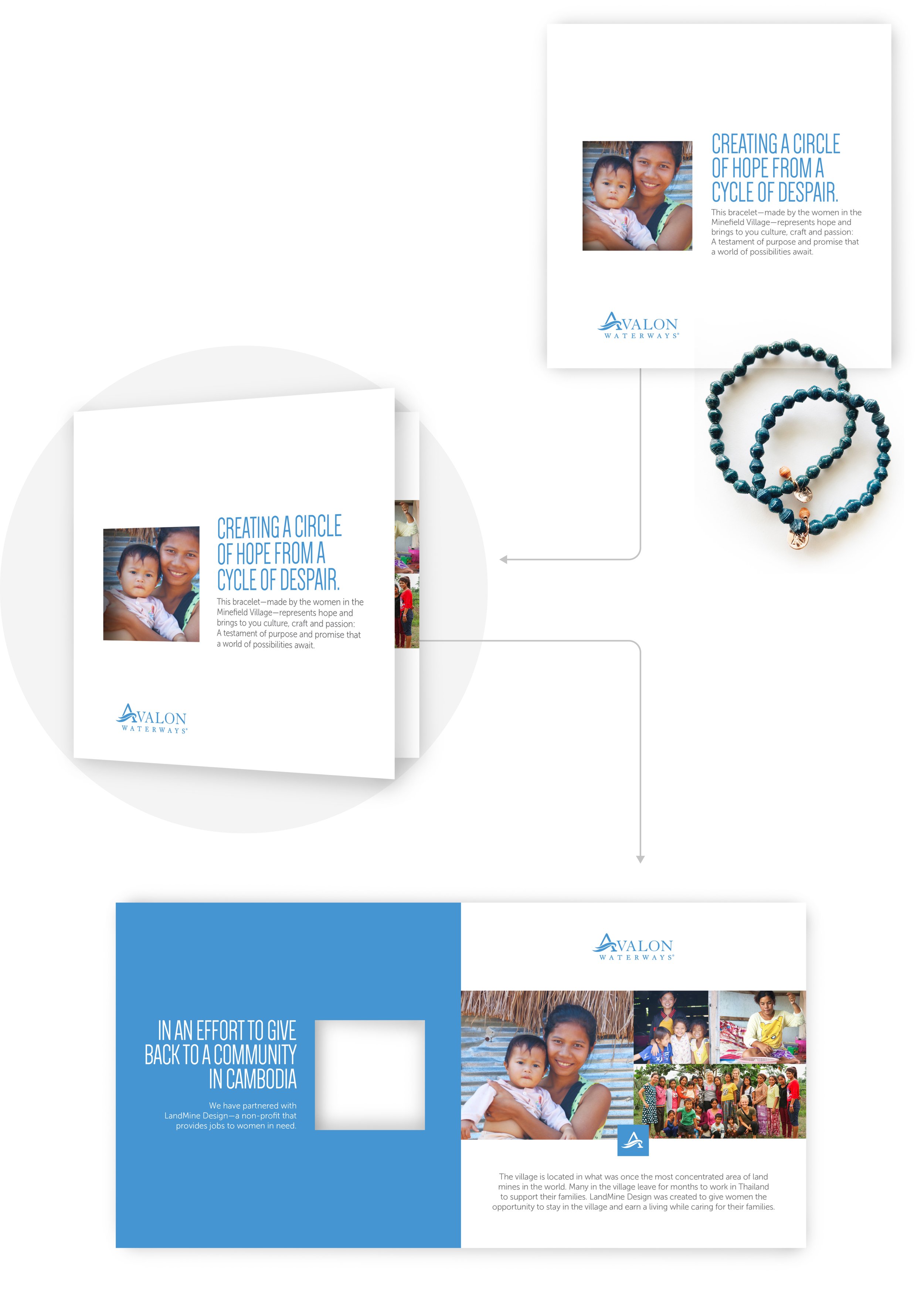
A GIFT FOR A GOOD CAUSE
This card was delivered to each passenger’s suite along with LandMine Design bracelets. Avalon partners with LandMine Design, a non-profit that provides jobs to women in need. I used the same “window” die-cut, revealing the image of a mother and employee of LandMine Design, drawing attention the the cause behind the gift.
